
Oenone Hammersley creates art that feels rooted in the soil, air, and water. Her connection to nature runs deep—she paints with the urgency of someone who has been paying attention for a long time. Rainforests, rivers, wildlife, and open skies aren’t just her subjects—they’re the lifeblood of her work. Using a blend of realism and abstraction, Hammersley captures both the physical beauty of the natural world and the quiet warning signs that it’s under threat. Her paintings hold space for wonder and concern. They’re not loud, but they don’t whisper either. There’s clarity in her brushwork, a sense of responsibility without preaching.
This year, Hammersley will exhibit at several international art fairs, including Art 3F Paris (September 26–28, 2025) and Le Carrousel du Louvre Art Fair (October 17–19, 2025), both with Parcus Gallery. She’ll also show at Art Miami(December 2–8, 2025) with Walter Wickiser Gallery. To view her portfolio, visit www.oenonehammersley.com.
Rainbow River Series: Where Color and Flow Collide
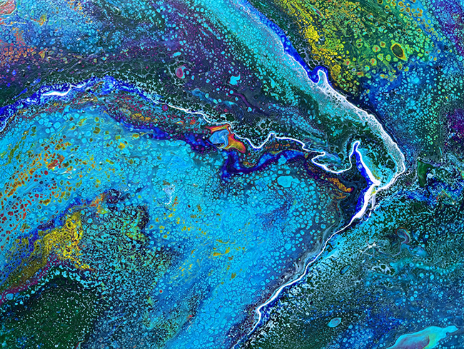
Rainbow River 1
“Rainbow River 1” invites you in without ceremony. There’s no fixed point of entry—you just fall into the current. Shades of blue, from near-black to pale and ghostlike, create a shifting field that feels as if it’s moving beneath your gaze. It’s not a literal river, but it doesn’t need to be. The sensation of flow is enough.
Hints of orange and green surface here and there, as though light is catching on water. The contrast isn’t jarring—it’s paced, intentional. It feels like a living system. The brushwork is layered and physical; some sections are smooth, others rough, dragging the eye across different surfaces and depths. Hammersley doesn’t try to mimic nature—she channels it. The result is a painting that pulses gently with presence.
Rainbow River 2
The second work in the series turns up the intensity. “Rainbow River 2” pulses with warmer tones—bright oranges and leafy greens ripple through the canvas, sitting atop a deep aquatic base. Where the first painting was cooler and calmer, this one burns with more urgency, like sunlight heating the surface of a stream.
The textures are complex. Some sections appear to glide, while others feel like they’re pulling inward, suggesting movement, turbulence, even resistance. The way the colors bleed into one another feels spontaneous but not random. It mimics how nature behaves—messy, rhythmic, imperfect, alive. You don’t just look at this piece; you travel through it.

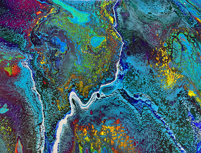
Rainbow River 3
The final piece, “Rainbow River 3,” widens the scope. The canvas feels like it’s been blown open. The blues return but now serve as a backdrop to bold bursts of red, yellow, and green. This is the most energetic of the three, almost as if the river has overrun its channel and spilled into a new form altogether.
The colors aren’t static. They stretch, twist, and interact like forces competing for space. But there’s no chaos—just motion. Some layers are bold and immediate. Others are buried, visible only after you’ve spent time looking. This creates a sense of depth that’s less visual and more emotional, like listening to a piece of music that slowly reveals its meaning.
The movement in this painting isn’t decorative—it feels necessary. Like a system in flux. Like nature trying to restore its balance.
Together, the Rainbow River series isn’t a literal map of a place. It’s a series of impressions—moments of clarity in the middle of change. Hammersley isn’t trying to define the river; she’s letting it speak in its own language. Each painting suggests that water is more than a subject—it’s a metaphor for everything that shifts, endures, adapts.
The work isn’t urgent in tone, but it’s never passive. It asks you to stop, to notice, to remember that nature is both familiar and fragile. In a time when the environment is often discussed in extremes, Hammersley offers a quieter way in—through color, flow, and form. Through art that moves like water and stays with you long after you’ve stepped away.