
Jane Gottlieb has spent a lifetime chasing boldness through pigment. She started in Los Angeles with brushes and paint, but over time, her creative path shifted. Photography caught her attention, and eventually, she found her rhythm by combining the two. More than thirty years ago, she began painting directly on Cibachrome photo prints—an intense, hands-on process that blended photography with the energy of painting.
That work laid the foundation for what came next. When digital tools arrived, she didn’t hesitate. She began scanning her hand-painted prints and refining them in Photoshop, creating vibrant works printed on aluminum, canvas, or paper. The digital version wasn’t a departure—it was a continuation. Her process has always been additive, building layer on top of layer, medium over medium.
Gottlieb’s art is immediate. The colors are loud. The compositions are full of movement. She doesn’t aim for subtlety or quiet beauty. She goes straight for impact—art that lifts, jolts, and surprises. For her, color isn’t about harmony. It’s about joy, and maybe even disruption. A reminder to see the world with brighter eyes.
Her installations at UCLA and UCSB—over 140 large pieces across multiple sites—are long-term projects meant to live with the public. She considers them more than decoration. They’re interruptions. Pops of color designed to pull you out of routine and offer something cheerful, maybe even strange, in an otherwise muted space.
Frank Gehry Series
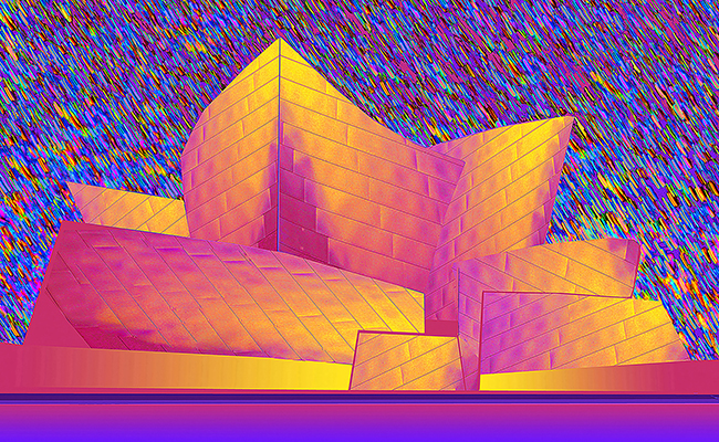
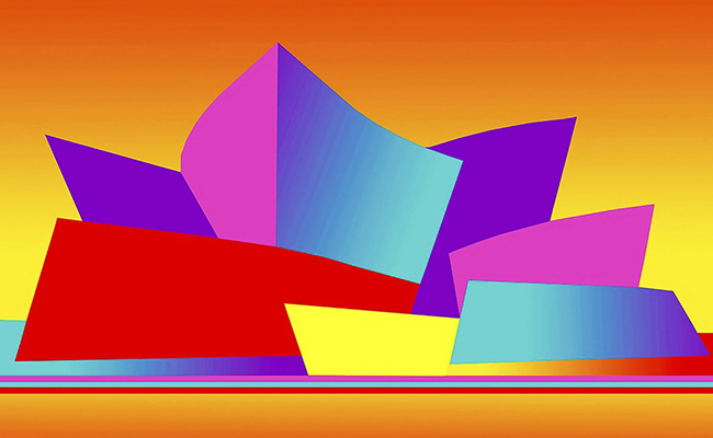
Jane Gottlieb’s Frank Gehry series is part memory, part transformation. She worked with Gehry decades ago, photographing his designs before they became internationally known. That early experience never left her. She kept photographing his buildings, especially in Los Angeles and Bilbao. Over time, she began to reshape those images, using Photoshop to explore her own relationship to his work.
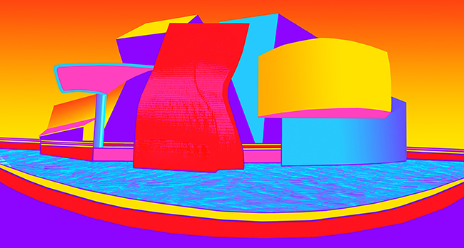
Gehry’s architecture is already full of movement—metal that twists, bends, and rejects convention. Gottlieb takes that motion and adds color. Bold, hyperreal color. Magenta, teal, yellow, fuchsia. She shifts the mood of the structures by changing their palette and surroundings. Gehry gives her form; she gives it emotional temperature.
The buildings stay recognizable, but the world around them shifts. Orange skies, electric gradients, water that looks like stained glass. She isn’t aiming to replicate Gehry’s designs—she’s responding to them. Bending space, flattening shadows, heightening contrast. The images become something else entirely—less about place, more about feeling.

Photoshop becomes her tool for invention. Her edits don’t just enhance; they push. She’s not correcting reality—she’s creating a new one. A version where steel glows and buildings seem to levitate. It’s playful, but not careless. She’s precise with her chaos.
Each piece carries a pulse. They don’t feel like still images. They feel like snapshots taken in the middle of a dream—wild but familiar. There’s humor in the color, but also admiration. This is her way of being in conversation with Gehry. She meets his looseness with her own.
What comes through most in the series is her ongoing curiosity. She isn’t trying to document Gehry’s genius. She’s taking what inspires her and turning it inside out. Her edits are explorations—ways to stretch the image, question it, and find new possibilities within it.
This is Jane Gottlieb’s style across all her work. She finds something she loves—cars, landscapes, architecture—and she paints over it, edits it, brightens it, until it reflects how she sees it in her head. Not just accurately, but fully. Loud. Alive. Energized.
The Gehry series isn’t about the buildings. It’s about what happens when a long-held fascination gets filtered through color, technology, and time. It’s about freedom—the freedom to keep pushing, to stay curious, to turn memory into something electric.