
Born in Philadelphia and now based in Manhattan, Toni Silber-Delerive brings a graphic, bird’s-eye view to the world around her. Her background reflects a deep and steady dedication to art. She studied painting at the Philadelphia College of Art, earned a BFA and art education certificate from Kean College of New Jersey, and furthered her skills in graphic design and silkscreen at New York’s School of Visual Arts. That mix—fine art training, education, and graphic design—makes sense when you see her work. It’s thoughtful, clean, and intentional, but it’s also bold and visual. Her paintings aren’t just observations; they’re designed.
Silber-Delerive’s art has been shown in New York and beyond. She’s had solo shows at the National Arts Club, the NY Studio Gallery in Chelsea, and other spots. Her pieces appear in private and public collections, and she’s remained active in both gallery and community settings for years.
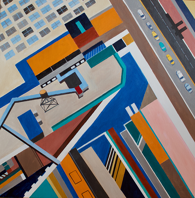
A View From 34th Street
In 34th Street NYC, Silber-Delerive turns one of Manhattan’s busiest streets into a study of shape, rhythm, and space. The painting is square—30 by 30 inches—and done in acrylic on canvas. It doesn’t look like a typical city scene, though. There’s no street-level drama. No people. No shop signs. What you see instead is the city from above, reduced and restructured.
The rooftops become flat blocks of color. Windows line up like dots in a matrix. Cars, if they appear at all, are barely recognizable as cars—more like color-coded punctuation marks. The whole piece hums with geometry. It’s not about realism or even mood, necessarily. It’s about layout. Structure. The surface of the city as pattern.
Silber-Delerive talks about “flattening the picture plane,” and that’s exactly what’s happening. Traditional depth disappears. There’s almost no shadow. No tricks of perspective to create distance. Everything exists on a single visual plane. That decision—intellectual as much as aesthetic—brings the viewer into the mechanics of the composition. You’re not looking into the painting. You’re looking at it. That shift is subtle but important.
This way of working shows Silber-Delerive’s background in design. There’s a designer’s logic here, a control over balance and repetition. At the same time, it’s clear that she’s not just arranging shapes for decoration. The abstraction reflects a deeper curiosity—about how we live, how we organize space, and how cities are mapped out from above.
Her Manhattan aerials as a series are personal. She lives here. She knows the street names, the rooftops, the flow of traffic. But instead of showing the city in its chaotic, loud, everyday sense, she chooses a higher view—almost like a drone or helicopter shot, but filtered through painting. There’s distance. The noise is stripped away. What remains is structure.
Pattern vs. Representation
In 34th Street NYC, there’s tension between what’s being shown and how it’s being shown. You can recognize the city, but just barely. It leans into abstraction. The grid matters more than the traffic. The overall composition holds more weight than the individual parts. This balance between representation and pattern gives the painting its energy.
That push and pull—between abstract and real, flat and spatial—is where Silber-Delerive’s work lives. She isn’t documenting the city in a literal sense. She’s reimagining it. And she’s doing it with a painter’s eye and a designer’s sense of form.
Her use of color is part of that strategy. She doesn’t go for photorealistic tones. The palette is edited—purposeful and clean. Warm reds might stand in for brick buildings. Cool grays for sidewalks. Bright pops might mark awnings or taxis. But again, these are choices, not depictions. The painting feels less like a record and more like a distillation.