
Paul “Gilby” Gilbertson has always worked from the inside out—starting with materials, paying attention to how they react, and learning how to steer them without squeezing the life out of them. Back in the early 1970s, he came across a watercolor method that would become closely associated with his paintings: sprinkling salt into wet washes to coax out organic, crystalline textures. It wasn’t something he set out to invent. It happened unexpectedly, the way many strong studio discoveries do. What matters is what came after. Gilbertson didn’t treat the result like a novelty; he kept testing it, adjusting timing and density, and figuring out how that texture could deepen the mood of an image. Over the years, what began as chance became part of his visual toolkit—useful for building air, water, and atmosphere while still respecting watercolor’s transparency and its tendency to surprise you.
Watercolor asks for a particular kind of discipline. You make a choice, you lay it down, and then you accept that water has its own agenda once it hits paper. Gilbertson seems comfortable in that give-and-take. His paintings feel intentional but never stiff. The washes stay light and open. Edges drift when they should, then snap into focus where the subject needs definition. And across the surface, you can spot the quiet fingerprints of salt: pigment separating into tiny blooms and flecks that hint at current, haze, mist, or the soft grit that exists in real landscapes and waterways.
That’s why the salt technique matters here—it isn’t an add-on. It functions like a framework. It breaks up broad areas so they don’t go flat. It creates depth without piling on heavy layers. And it echoes textures we recognize in the world around us: the grain of sand and stone, the veil of water, the shifting unpredictability of sky. In Gilbertson’s work, those marks don’t call attention to themselves as a “special effect.” They read as environment, as a believable atmosphere that the subject is actually moving through.
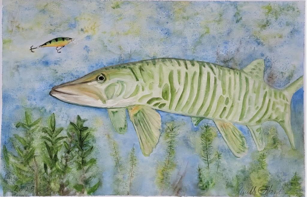
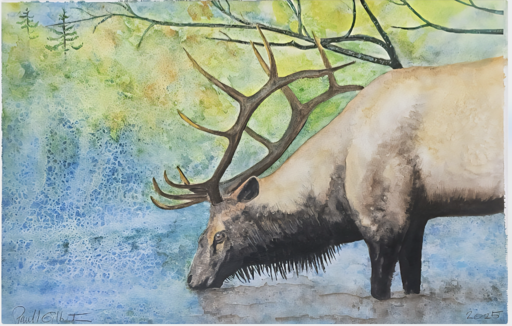
The two 2025 paintings you shared make this clear because they show the same approach applied to two different kinds of space. One takes place underwater, where a large Musky moves through a cool, blue-green field. The other sits at the edge of a pool, where an elk lowers its head to drink. Together they feel like companion pieces—quiet scenes that hold a low hum of tension, with technique serving the feeling rather than competing with it.
In the fish painting, everything is composed with calm clarity. The fish sits large in the frame, almost like a portrait—steady, direct, and fully present. Pale green striping follows the curve of its body, describing volume without relying on hard contour lines. The eye is handled with care, giving the fish a watchful presence. In the upper left, a lure hangs in the water—small, simple, and loaded. It suggests a story without overexplaining: attraction, pursuit, risk. Below, aquatic plants rise like a soft barrier, anchoring the scene and adding depth. The background wash—layered blues and greens, broken by mottled texture—reads instantly as water. It’s one of watercolor’s strengths: not a literal diagram of “underwater,” but the sensation of being inside it.
The elk painting carries a different weight. The animal’s body dominates the right side, and the lowered head captures a private, unguarded moment. The antlers stretch outward like branching architecture, echoing the tree limbs above and creating a natural rhythm of line. The background feels sunlit and open—greens and yellows suggesting foliage and filtered light—while the left side holds a lively blue field of texture that sits somewhere between water and air. The darker neck fringe and legs bring gravity, keeping the image grounded. And again, there’s a smart balance: the elk is described clearly enough to feel real, while the surrounding space stays loose, atmospheric, and painterly.
One of the strongest qualities in both works is Gilbertson’s restraint. He doesn’t pack the paper. He leaves room for the wash to breathe. He lets suggestion do a lot of work. That kind of control isn’t flashy—it comes from practice, from knowing when to stop, when to leave a passage alone, and when texture can add complexity without cluttering the scene.
These two 2025 paintings sit within an ongoing body of work that reflects Gilbertson’s long relationship with watercolor and his continued pull toward nature as subject and setting. They also connect to something beyond the studio. Gilbertson has established Gilby’s Foundation for the Arts, with a focus on donating artwork to help raise funds for nonprofit organizations and charities across America. It’s a direct extension of what the paintings already communicate: attention, care, and a respect for what sustains life.
It’s easy for art conversations to get trapped in promotion and visibility. What feels refreshing here is the added purpose—work that can live as imagery, and also as support. The foundation reframes the paintings slightly: they aren’t only scenes of wildlife and place, but objects that can participate in helping others.
In the end, Gilbertson’s work holds because it feels truthful to the medium. Watercolor doesn’t let you hide. It reveals your choices, your timing, and whether you’re trying too hard to control the outcome. In these paintings, the opposite comes through: steadiness, patience, and an easy confidence in letting water do what it does best. The salt textures—born from a chance moment decades ago—continue to function not as a gimmick, but as part of his natural vocabulary. And that vocabulary gives these scenes their quiet pull.
For more about the foundation, visit: www.GilbysFoundationfortheArts.info