
Kathryn Trotter’s paintings come in full volume—rich color, palpable texture, and an obvious enjoyment of paint as a material. On a quick read, the work feels lush and spirited: animals set like portraits, surrounded by flowers, pattern, and thick passages of pigment that you can almost trace with your eyes. Stay with it a little longer, though, and the underlying order starts to show. The brightness isn’t random. It’s held up by design instincts that come from where she started. Trotter first trained in textiles and fashion design in Texas, a world where construction matters and every layer has a job—pattern against pattern, surface against surface, detail balanced so the whole doesn’t collapse. Later, in San Francisco, she studied trompe-l’oeil, the tradition of visual illusion that depends on careful observation and the patience to make the unreal look convincing. Even when her paint handling is loose and energetic, those two roots—material awareness and optical discipline—still shape what you’re seeing.
Her approach sits at the intersection of impressionism and thick impasto, and that mix is key to the experience. The impressionist sensibility keeps the brushwork visible and allows color and light to carry the description instead of tight line work. The impasto adds heft. Paint becomes substance, not just a coating. Up close, you notice ridges, peaks, and dragged strokes—places where the brush has left a record of speed, pressure, and decision. Light lands on the raised areas and shifts the image slightly as you move. Denser marks cast tiny shadows. Softer passages create a breather so the eye can reset before diving back into the busy parts. These paintings reward movement: step forward to read the surface, step back to see it resolve, then move in again and watch it reorganize.
Animals appear frequently in Trotter’s work, but she doesn’t treat them like traditional wildlife subjects. She treats them like sitters—posed, centered, and given a carefully built environment. Instead of placing an animal into a realistic landscape and asking you to admire it from afar, she brings it forward and constructs a surrounding world that functions like costume and stage set. Flowers operate like adornment. Pattern behaves like atmosphere. Decorative cues act like narrative. The result is playful, yes, but it’s also purposeful: the animal becomes more than subject matter. It becomes a character with presence—attitude, elegance, and a hint of theatrical confidence.
Two paintings that capture this sensibility are “Lilly Ruben” (sold) and “Le Tigre” (available). Both are oils on canvas, both presented in gold-edged floater frames, and both lean into a visual language where ornament is not extra—it’s part of the meaning. In both works, Trotter uses the language of beauty to hold your attention long enough for the deeper craft choices to register: how she balances a centered subject against surrounding detail, how she uses patterned areas to push space forward or pull it back, and how she sets up color contrasts that keep the surface alive.
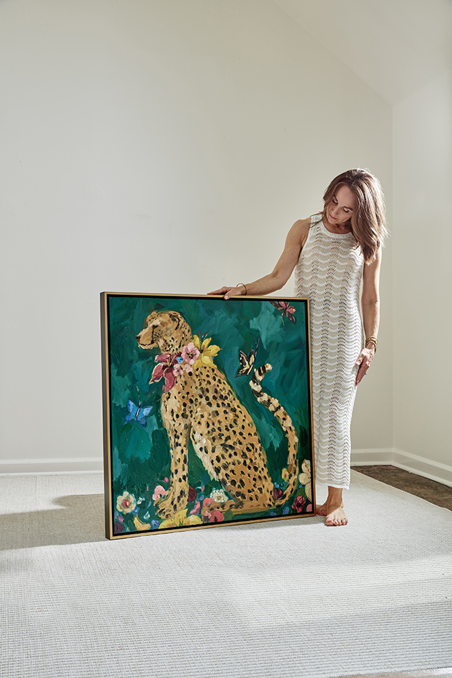
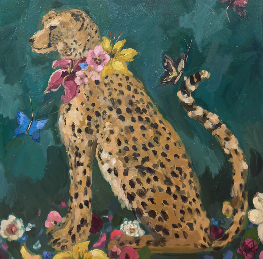
“Lilly Ruben” is a 36×36” cheetah portrait, described as bold and colorful, with the animal wearing a dramatic collar of flowers. The square format supports the directness of the composition. It keeps the cheetah front and center, like a formal portrait that refuses distraction. The floral collar works on multiple levels. It frames the face the way a historical ruff might frame a sitter, turning the cheetah into something almost ceremonial. It also gives Trotter room to amplify her strengths: building rhythm through repeated shapes, stacking colors so they vibrate, and using thick paint so petals feel constructed rather than merely depicted. There’s a satisfying push-and-pull in the idea itself—sleek animal energy against lush floral abundance, speed against flourish. The painting doesn’t ask you to admire the cheetah from a safe distance. It brings the personality right up close.
The gold-edged floater frame reinforces that sense of presentation. It doesn’t fade into the background; it supports the idea that this is a portrait meant to stand out and hold a room. “Lilly Ruben” was sold through Design Supply Shop in Birmingham, Alabama, a context where art often functions as both statement and atmosphere within an interior. The work’s journey also includes a human moment: a photo of the artist with “Lilly Ruben” credited to Patrick McGough (Birmingham, AL). It’s a small detail, but it grounds the painting in real time and place—an artwork moving through people and spaces, not just circulating as a digital image.
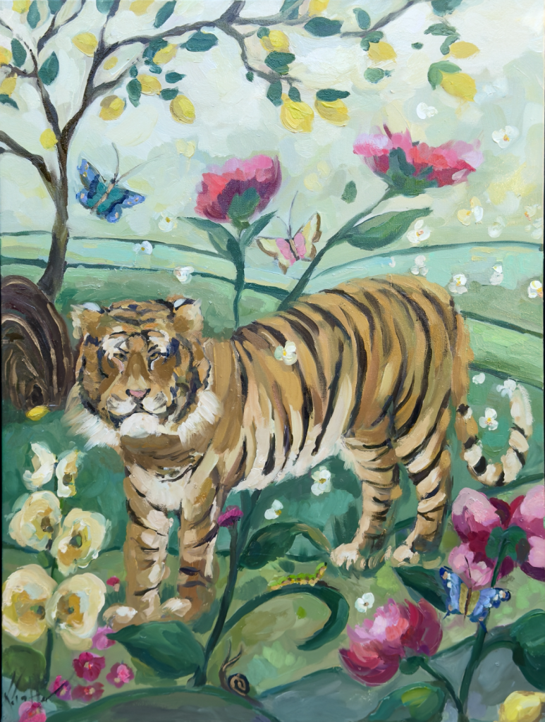
Where “Lilly Ruben” feels concentrated and iconic, “Le Tigre” opens outward into a fuller, more immersive setting. At 36×48”, it gives Trotter more room to build a world. The painting belongs to her “Life in Bloom” collection and is described as a vivid scene featuring a tiger within a chinoiserie-inspired environment filled with flora and fauna. That’s a natural fit for her. Chinoiserie carries its own history of decorative storytelling—patterned landscapes, stylized nature, ornamental abundance. Trotter uses that language as a stage and sets the tiger as the anchor within it. Pattern becomes environment. Ornament becomes narrative. The scene feels curated and lush without flattening into mere decoration, because the tiger holds the center with authority.
A lemon tree appears in “Le Tigre,” described as “a bonus,” and it’s easy to understand why that detail lands. Lemons bring sharp, bright notes and a touch of wit—little bursts that punctuate the surrounding florals and foliage. They add freshness to the scene while also acting as a compositional device, echoing shapes and helping the eye travel. Like “Lilly Ruben,” “Le Tigre” is framed in a gold-edged floater frame, keeping the presentation cohesive and emphasizing that these works are made to feel complete and confident on a wall. The painting is available through Michael Mitchell Gallery in Charleston, South Carolina, where viewers can experience what photographs can’t fully deliver: the paint’s physical build and the way light plays across impasto.
Together, these paintings show what drives Trotter’s practice. She merges training with instinct, design with sensation. She pulls from portrait conventions, textile thinking, and trompe-l’oeil discipline, then filters it through thick paint and fearless color. The result is celebratory without being careless—work that holds attention because it’s constructed, layered, and intentionally alive.
“Le Tigre”
36×48″ oil on canvas can be purchased at Michael Mitchell Gallery in Charleston, SC
843-577-0400